What Problem Did the City of Houston Face Ahead of the World Cup?
Houston is a FIFA World Cup host city, and in August 2025 the Office of Emergency Management began asking whether its tools were ready for the largest crowds in the city's history. The answer was complicated. By the city's own estimate, roughly ninety percent of the data it needed already existed. Houston Public Works had spent the better part of a year organizing data sharing across departments, and the feeds were there: weather in one application, traffic in another, special event plans in Esri's Special Event Operations solution on yet another screen. What was missing was the connective layer: a way to see those feeds side by side, understand what was happening around an event spatially, and analyze everything together.
The Pitch: A Working Wireframe Instead of a Slide Deck
Houston's OEM leadership sets a high bar for what earns a place in its operations center. The office had dashboards; what it wanted was something no off-the-shelf product offered, and Anthony Powell of Houston Public Works was confident dymaptic could deliver it. So instead of a slide deck, our team built a clickable wireframe: an interactive prototype with a live-looking map of NRG Stadium and the downtown Fan Fest, switchable executive, operational, and public views, a panel of live data feeds with their owning departments, and an AI threat assessment gauge scoring nine contributing factors. It ran on sample data, but the vision was real: leadership could see, on one screen, what it would mean to watch the whole city at once.
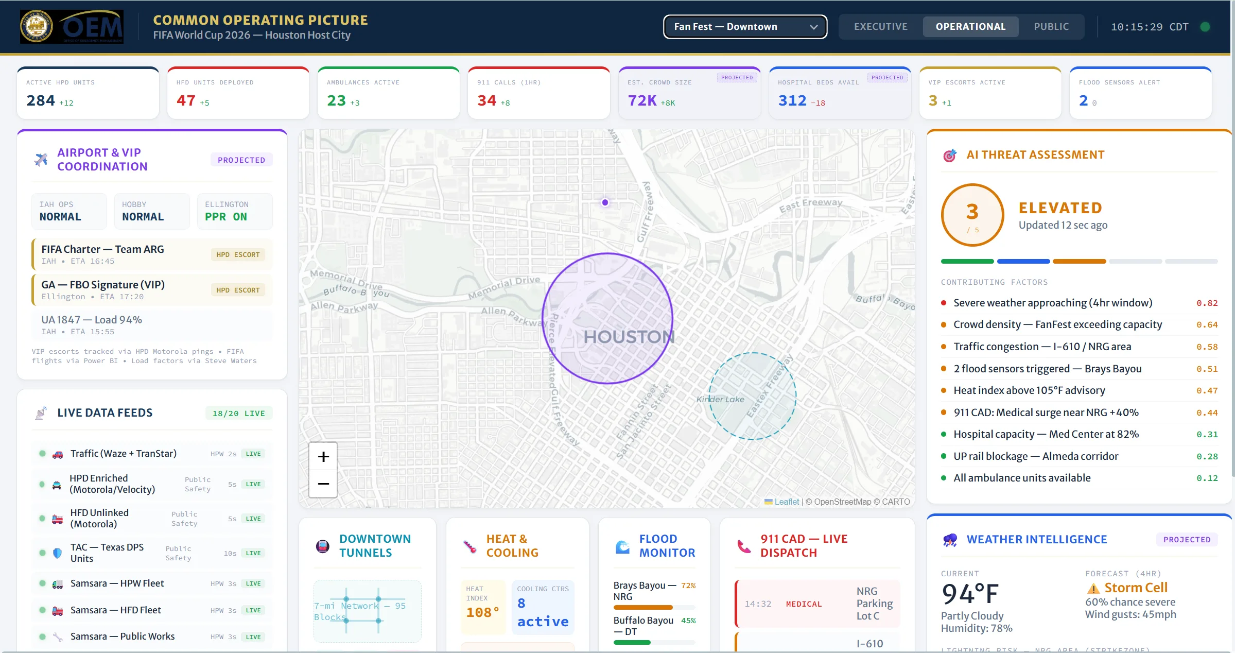
The wireframe did what no requirements document could: it gave Houston a visual of the destination and the confidence that the finished product would live up to it. Powell, who championed the project from the start, later described that moment in his own words: "When I spoke with you about needing to deliver something that was more than just a regular dashboard and you put together that proof of concept... I didn't fathom that it would turn out to be this. The potential looks even more promising."
Our Approach: One Picture for Every Kind of Event
Together, the city and dymaptic landed on what Houston's emergency managers called a common operating picture: one application for organized events like the World Cup, for rain events that flood underpasses and reroute traffic, and for ordinary days in between. The piece that made it more than a dashboard was the AI-integration. The dymaptic team proposed a risk engine that watches everything the application sees, analyzes it continuously, and produces a score that tells the room where to look and informs decisions.
That ambition drove the first major technical decision: ATLAS would be a custom web application built on the ArcGIS Maps SDK for JavaScript with Esri's Calcite Design System, not a configuration of an off-the-shelf dashboard product. A custom build gave dymaptic the freedom to create configurable views, deep AI integration, and a war-room-first interface, while everything underneath stayed in Houston's ArcGIS Online web map, where the city's GIS staff maintain layers, symbology, and pop-ups themselves. The same principle held for events: ATLAS reads monitored areas directly from the city's Esri Special Event Operations solution, so everything is maintained in one place and event staff never changed their workflow.
What We Built: Inside ATLAS
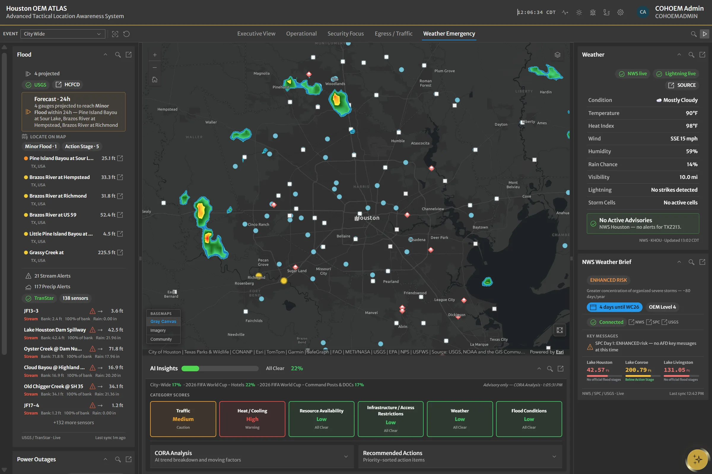
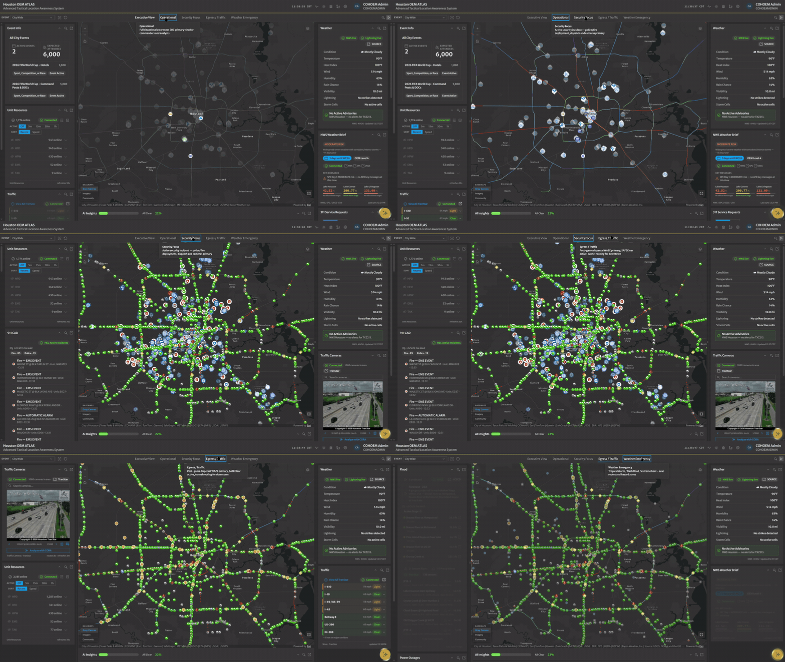
ATLAS reads from a web map that serves as the single source of truth, with live feeds flowing in through ArcGIS Velocity from multiple ArcGIS Online organizations across the city, so each department keeps managing its data exactly where it always has. Key components include:
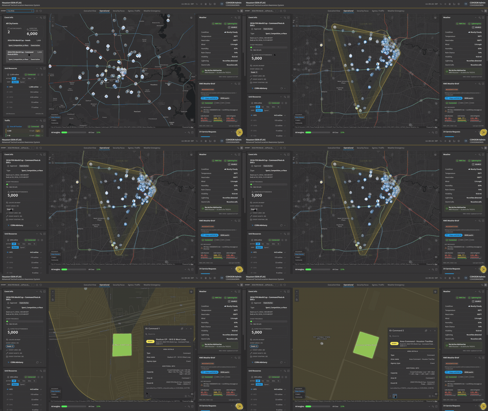
- Special event info widget: consumes the same services that power the city's Esri Special Event Operations solution, with no workflow changes, and displays event areas, routes, point assets, and staffing with full spatial context.
- Live officer-to-post tracking: ties event staffing plans to live Houston Police Department radio feeds, drawing a visual line between where each assigned officer is and where their post is. This capability did not exist before ATLAS.
- Unit resources widget: Houston Police Department radios and vehicles, Fire Department, Public Works vehicles and equipment, EMS, and outside Texas police radios, with activity filters and speed sorting.
- Traffic widget: Houston TranStar incidents, road closures, Waze alerts and irregularities, and roughly 1,300 searchable traffic cameras, with corridor status driven by average speeds.
- Flood and weather widgets: USGS flood gauges, TranStar stream and roadway flood alerts, National Weather Service alerts, and commercial lightning detection and storm-tracking intelligence, informing decisions like when to open a dam ahead of heavy rain.
- CORA, the in-app AI assistant: answers questions about live conditions, opens widgets on request, and can analyze what a traffic camera is showing.
Because ATLAS consumes so many live feeds, map legibility was a real design problem. The dymaptic team used Maps SDK feature effects to blur and highlight features contextually, so selecting a TranStar incident or an event polygon focuses the map on exactly what matters. An interactive guided tour, a data-source health indicator showing the live status of every feed, and a bug reporter that files issues straight to the development backlog with a screenshot attached round out the application.
AI Risk Scores Tuned by the People Who Know the City
The AI risk engine is what makes ATLAS a decision-making tool rather than a data viewer. It computes a citywide risk score and a separate score for each active event, using an automatically computed boundary around the event to pull in only the relevant features. Critically, the city controls the weights. Emergency managers set how much each input matters, because they know things no model does: an indoor event cares more about traffic and emergency call activity, while an outdoor event cares about lightning strikes near an approaching storm. Weight configurations can be exported and imported as JSON, so the city can prepare a tuned profile in an event planning meeting and load it on game day.
The city also set the rules for how AI behaves in front of its operators. Anything AI-generated is labeled as AI-generated, a mandate from Houston Public Works, and the assistant never changes an operator's screen without confirmation. When the city asked for risk indicators in plain language instead of percentages, the scores became low, medium, and high. The team at dymaptic built the engine layer-agnostic, so when Houston adds a new feed, like network outage status, the AI can score it without redesign. Configure, label, confirm: the AI advises, and the people who know the city decide.
How We Built It: Weekly Demos and Real Events as Test Beds
Development kicked off in mid-March with a working MVP inside ten days, and the rhythm never changed: near-daily syncs inside dymaptic, a standing weekly demo with the city, and AI-assisted development that let a small team move at the pace the deadline demanded. Houston never waited until the end to test. The city ran ATLAS side by side with its existing system during the Art Car Parade weekend in April, exercised it through one of the spring's biggest rainfalls, and made the June 6 Pride parade the production dress rehearsal before the tournament. Feedback from each event came back through the in-app bug reporter and turned into fixes before the next one.
That loop visibly reshaped the product. The first design featured a rotating carousel of widgets; after watching it distract a real operations room, the city said so, and we threw it away rather than defend it, rebuilding it as a collapsible AI insights panel that keeps the score visible and moves nothing without the user's say-so. The same week-to-week responsiveness moved the risk engine from a scheduled notebook to a server-side geoprocessing service when five-minute scoring became the requirement, and added per-widget zoom after our team stood in the war room and could not read the wall monitors from across the room. By mid-May, ATLAS was feature-complete and deployed on the city's own servers.
The Results: Departments Sharing Data for the First Time
The biggest impact of ATLAS is organizational. Police, Fire, Public Works, EMS, and Houston TranStar each had their own data and their own environments; ATLAS is the first place all of those feeds come together, and everyone now works from the same view. By the numbers, ATLAS brings together 15 health-monitored live feeds (11 external sources plus 4 vehicle and radio streams) and 8 unit-tracking layers spanning 5 agencies, with 4 city departments contributing data through 3 city ArcGIS Online organizations, alongside Houston TranStar and external weather and hydrology providers. The weekly duty-officer report that once required checking five separate systems by hand can now be assembled almost entirely from ATLAS. The Director of the Office of Emergency Management used to build weather briefings by screenshotting National Weather Service pages into an email; ATLAS now presents that brief, overlaid on the city map, to anyone with access. Francesco Carmine of the Office of Emergency Management put the operational value simply when roadway flood warnings went live: "It gives us an extra five minutes of awareness before stuff happens."
ATLAS has been in production since May, ready for the World Cup, and Houston ran it from its war room throughout the tournament, with widgets popped out across a wall of monitors and each panel zoomed independently for visibility at a distance. After touring the deployed application, Patrick Alexander of the Houston Police Department told the team: "It takes a while to impress me, and y'all did a really good job. I'm thoroughly impressed."
The partnership is not done. Phase two will include 3D visualization, targeted text alerts for approaching storms, per-event AI weight presets, and a consolidated weather situation report on the roadmap. For a collaboration that began in 2019, ATLAS is the latest chapter, not the last.